Los Hermanos
Introduction
Los Hermanos Tequila is more than just a spirit; it's a legacy. Rooted in the rich tradition of Mexican tequila-making, the brand honors the bond of brotherhood and the shared passion for creating exceptional spirits.
CHALLENGE
Breaking into the US Market
While Los Hermanos Tequila boasts a rich history and exceptional quality, breaking into the highly competitive US market presented a significant challenge. The tequila landscape is crowded with established brands, each vying for consumer attention. To differentiate ourselves and capture the hearts of American consumers, we needed a compelling brand story and a strong visual identity.
Work
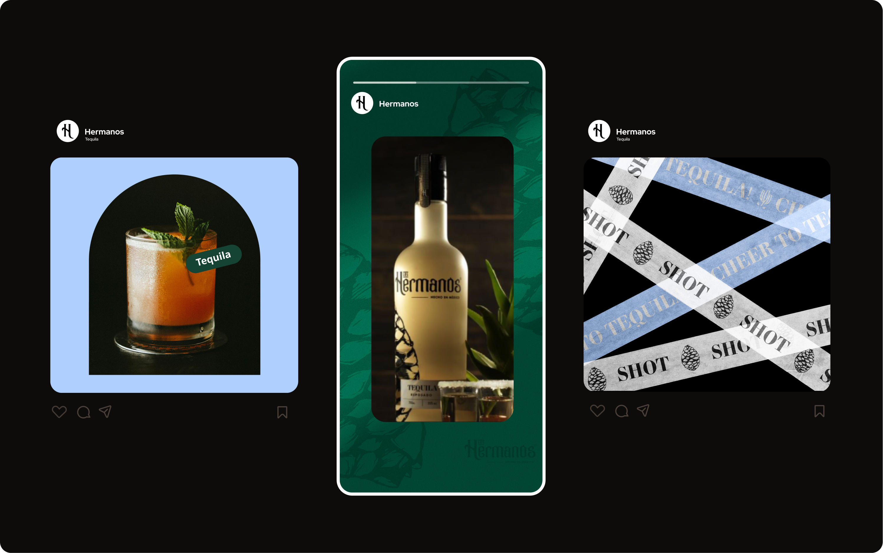
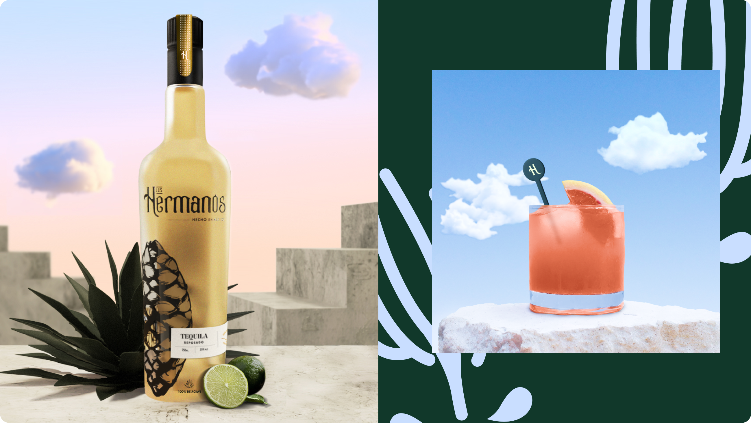
A Modern Take on Tradition
To capture the essence of Los Hermanos Tequila, we embraced a design approach that balanced tradition with modernity. The logo, inspired by the brand's name, features a bold, handwritten script that evokes a sense of family and heritage. The script is both elegant and rustic, reflecting the tequila's roots in Mexican culture.
The color palette, dominated by rich earth tones and vibrant accents, evokes the arid landscapes of Jalisco and the spirit of celebration. The overall design is clean, minimalist, and sophisticated, appealing to a discerning audience.
Brand Personality:
- Authentic: Rooted in tradition and family heritage.
- Modern: Forward-thinking and innovative.
- Social: Fostering camaraderie and connection.
- Bold: Confident and unapologetic.

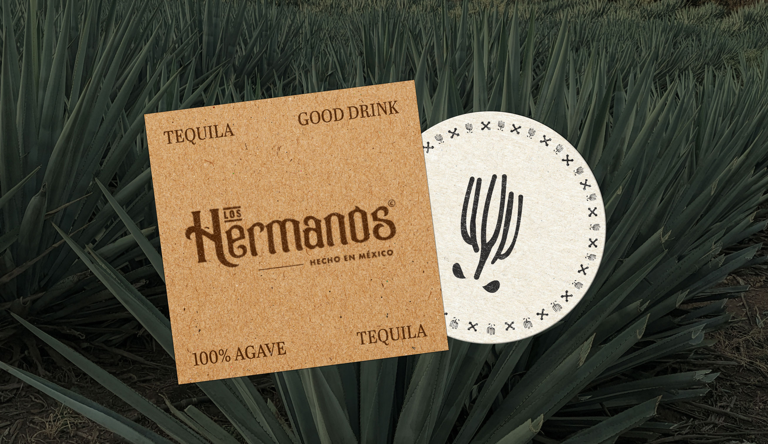
Logo:
- A bold, handwritten "Los Hermanos" script, capturing the brand's authentic and modern personality.
- A simple, clean design with a focus on the typography.
- The script can be used in various applications, from bottle labels to marketing materials.
Visuals and Materials