VMS Design System
Introduction
I had the privilege of leading the creation of a comprehensive design system from the ground up for Better Your Health, a parent brand encompassing multiple sub-brands within a unified ecommerce platform. While each sub-brand maintained its unique identity, they shared a common digital experience.
CHALLENGE
High-Level Challenges
The primary challenges we faced were:
- Complex Ecosystem: Balancing the need for a consistent design system across multiple brands with the requirement to maintain distinct brand identities.
- Tight Timeline: Adhering to a compressed timeline for design documentation and handoff to development.
- Previous System Complexity: Overcoming the limitations of a previous global design system that struggled to accommodate the diverse needs of the various sub-brands.
Work
Approach
To address these challenges, we adopted a strategic, collaborative, and iterative approach:
- Timeline Development: In close collaboration with the principal product designer, we created a detailed project timeline that outlined key milestones and deliverables.
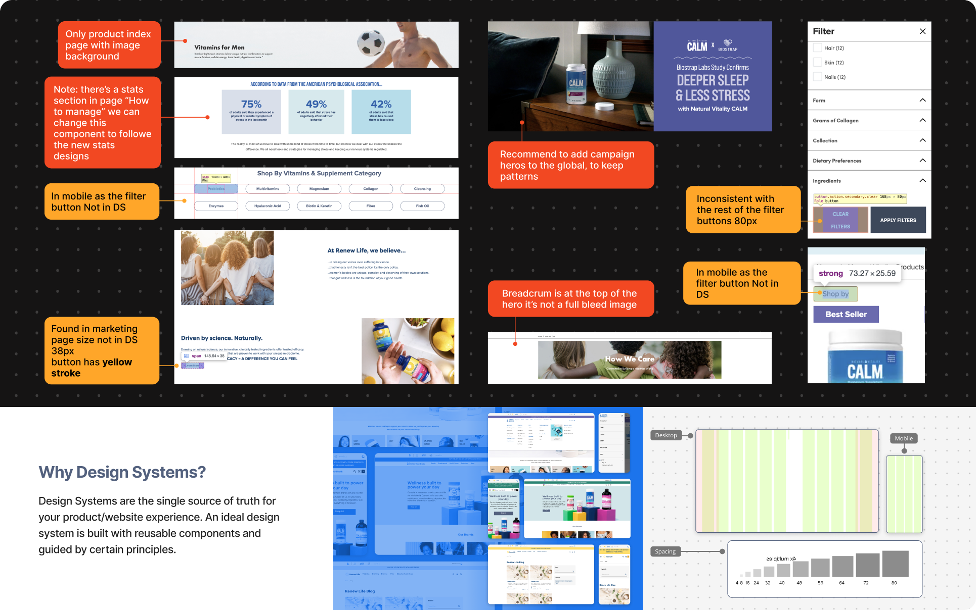
- Brand Identity Audit: We thoroughly reviewed the design assets for each sub-brand, paying close attention to their unique color palettes, typography, and visual language.
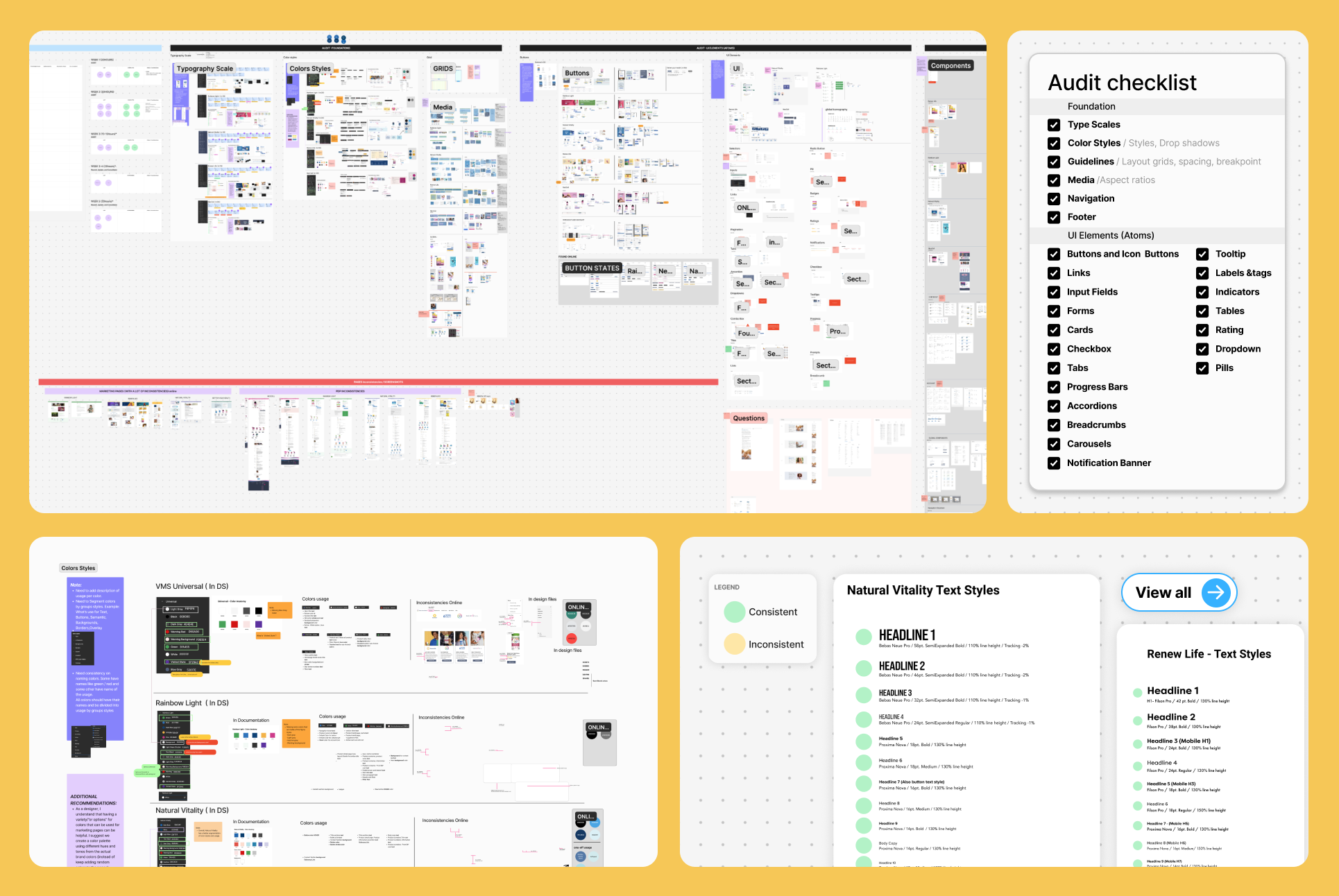
- Component Inventory: We conducted a comprehensive audit of the existing ecommerce platform, identifying and cataloging all reusable components, their variations, and their usage patterns.
Time to create components
Design System Framework: We established a robust design system framework
Starting with Foundations:
- Core Design Principles: A set of guiding principles to ensure consistency and user experience.
- Layout Grid: A flexible grid system to ensure consistent layout and spacing.
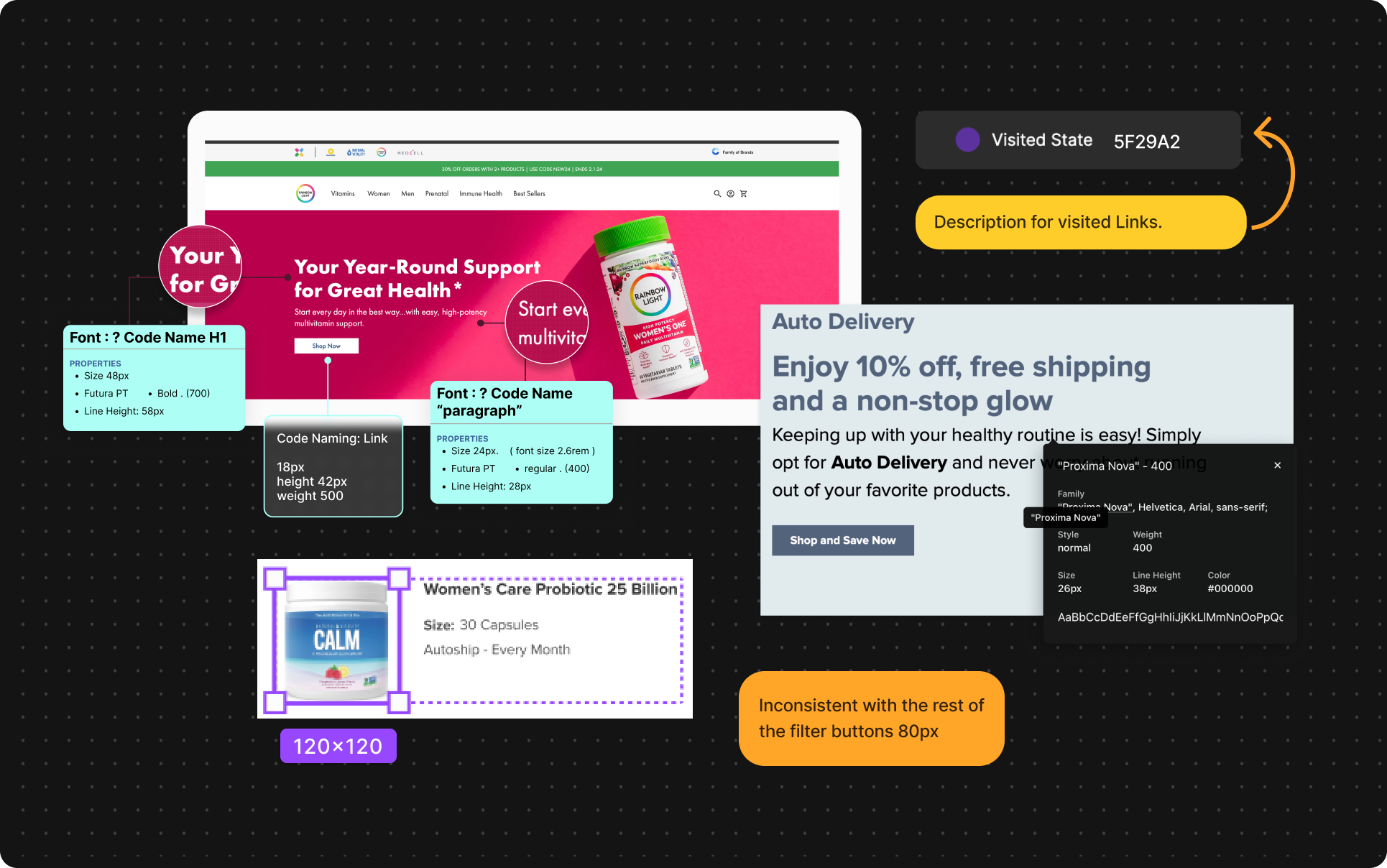
- Typography Scale: A typographic hierarchy that defined font sizes, weights, and spacing. The typography scale was designed to be legible and easy to read, even on small screens. We used a modular scale based on the golden ratio, which creates a visually pleasing and harmonious hierarchy. The scale was also designed to be flexible, so that it could be adapted to different screen sizes and devices.
- Color Palette: A curated color palette for each brand, aligned with their visual identity. The color palette was carefully selected to evoke the desired emotions and brand personality.

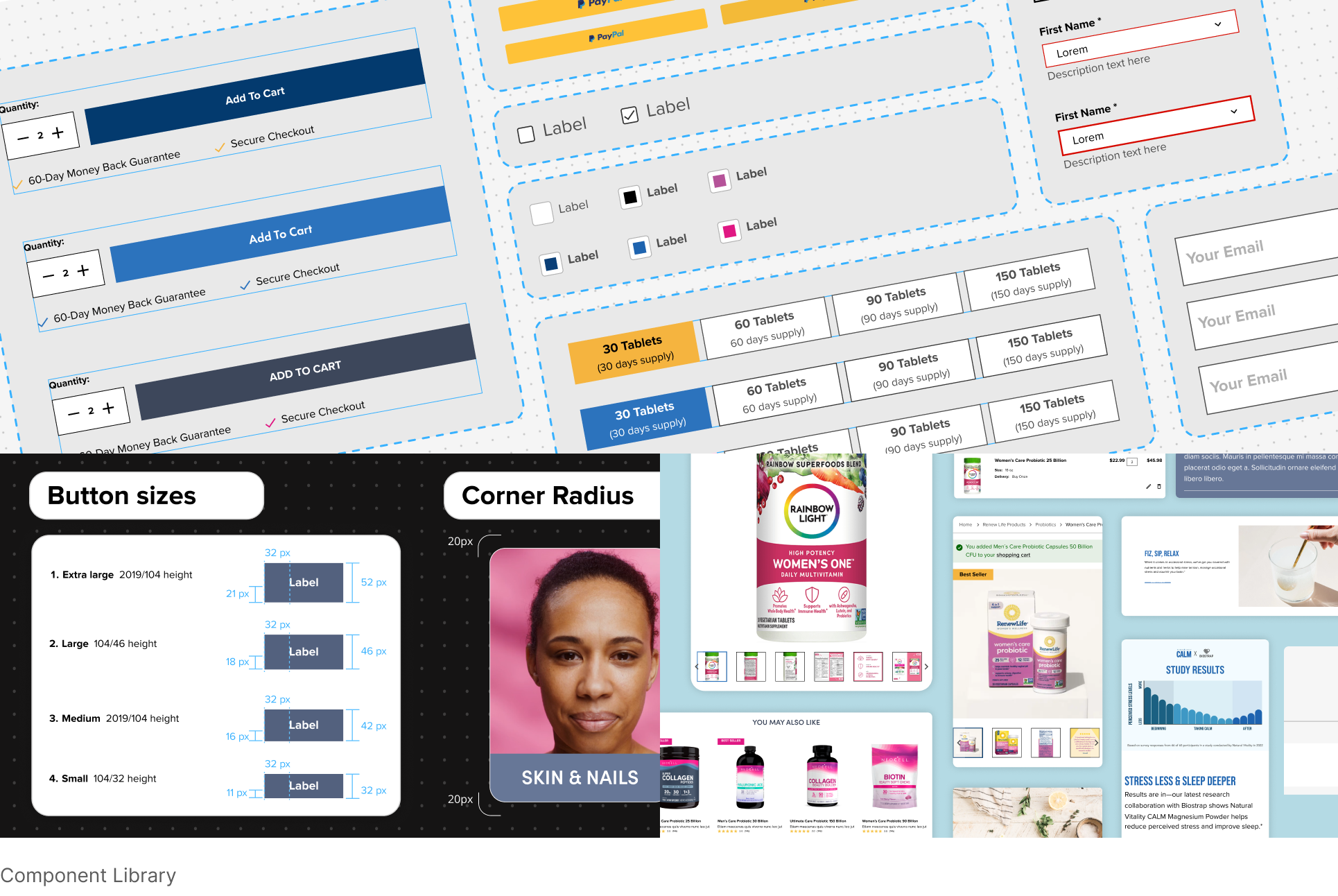
Component Library: A Balancing Act
To accommodate the diverse needs of each sub-brand while maintaining a cohesive design system, we developed a highly adaptable component library. This library was designed to be both flexible and efficient, enabling us to quickly create tailored user interfaces for each brand.
Key Features of Our Component Library:
- Brand-Specific Theming: We implemented a robust theming system that allowed us to easily switch between different brand styles. This included:
- Color Palettes: Customizable color palettes to match each brand's unique aesthetic.
- Typography: Flexible typography settings to adjust font sizes, weights, and line heights.
- Iconography: Brand-specific icon sets to enhance visual consistency.
- Component Variations: We created multiple variations of core components to suit different contexts and brand preferences. For example:
- Buttons: Various button styles (primary, secondary, tertiary) with customizable colors, sizes, and hover states.
- Input Fields: Different input types (text, email, password) with adaptive styling and validation states.
- Cards: Flexible card layouts with options for image placement, content density, and action buttons.
- Design Tokens: We leveraged design tokens to manage and maintain consistency across the design system. Design tokens are variables that represent design elements like colors, typography, and spacing. By using design tokens, we could easily update the design system globally, ensuring consistency across all components and pages.
By carefully crafting our component library, we were able to balance the need for brand differentiation with the efficiency of a centralized design system. This approach empowered our design and development teams to create beautiful and functional user experiences for each sub-brand.
Iterative Design and Collaboration is KEY
Throughout the design process, we fostered a collaborative environment with designers, art directors, and product managers. We conducted regular design reviews and feedback sessions to refine the design system and ensure it met the needs of both users and developers.
Key Outcomes
By implementing this comprehensive design system, we achieved the following:
- Increased Design Efficiency: The reusable component library significantly accelerated the design and development process.
- Enhanced Brand Consistency: The design system ensured a cohesive and consistent user experience across all sub-brands.
- Improved User Experience: The well-structured and accessible design system led to a more intuitive and enjoyable user experience.
- Successful Development Handoff: Clear and concise design documentation facilitated smooth collaboration between design and development teams.
Lessons Learned
- Early Collaboration is Key: Involving stakeholders early in the process is essential for aligning on design goals and ensuring buy-in.
- Iterative Design is Essential: Continuous iteration and feedback are crucial for refining the design system and addressing evolving needs.
- A Strong Foundation is Critical: A well-defined design system provides a solid foundation for future product development.
By prioritizing user experience, efficiency, and brand consistency, we successfully delivered a design system that empowers Better Your Health to deliver exceptional digital experiences.