UX Websites

Introduction
I have led over 50+ website redesign initiatives, transforming online presences for clients in varied industries including SaaS Products, Consulting Firms, Professional Services, Investment Firms, Healthcare, and Financial Services.
CHALLENGE
UX website redesign is a strategic process focused on improving the overall experience for users interacting with a website. It goes beyond simply updating the visual appearance, delving into how users navigate, find information, and complete tasks. The primary goal is to create a more intuitive, efficient, and satisfying experience that aligns with both user needs and business objectives. This often involves research, analysis of user behavior, restructuring content, streamlining navigation, enhancing accessibility, ultimately leading to increased engagement, higher conversion rates, and improved user satisfaction.
Work
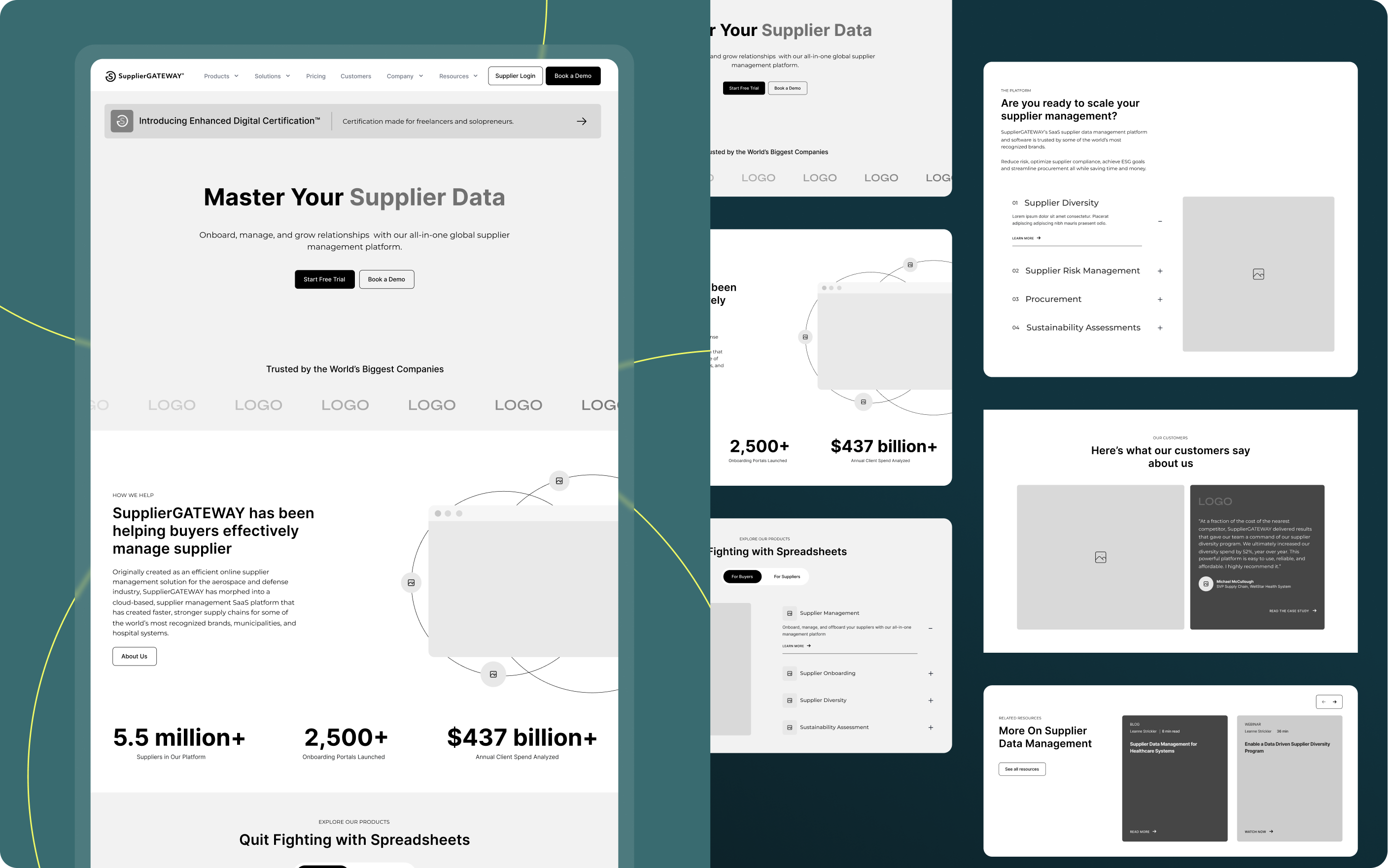
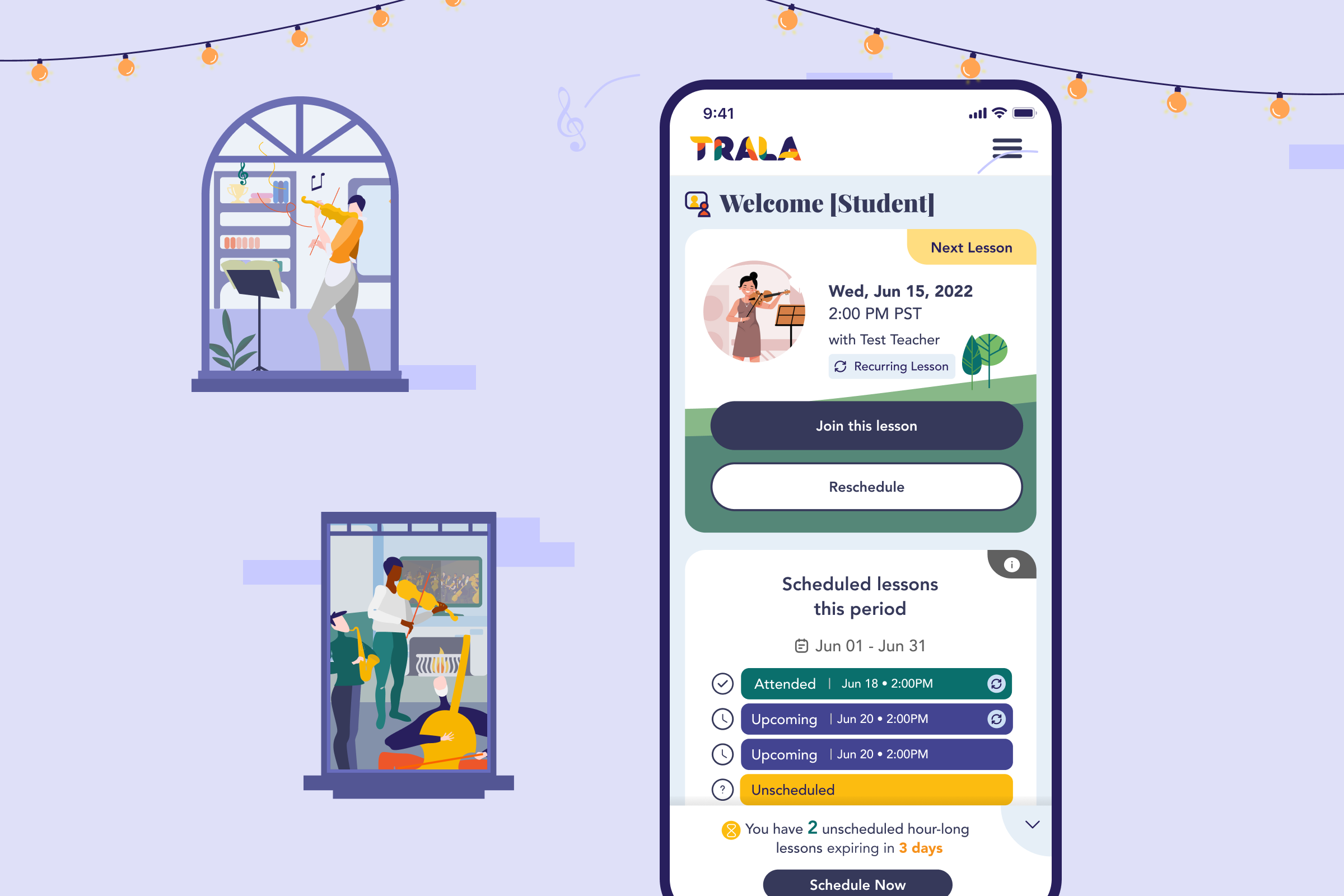
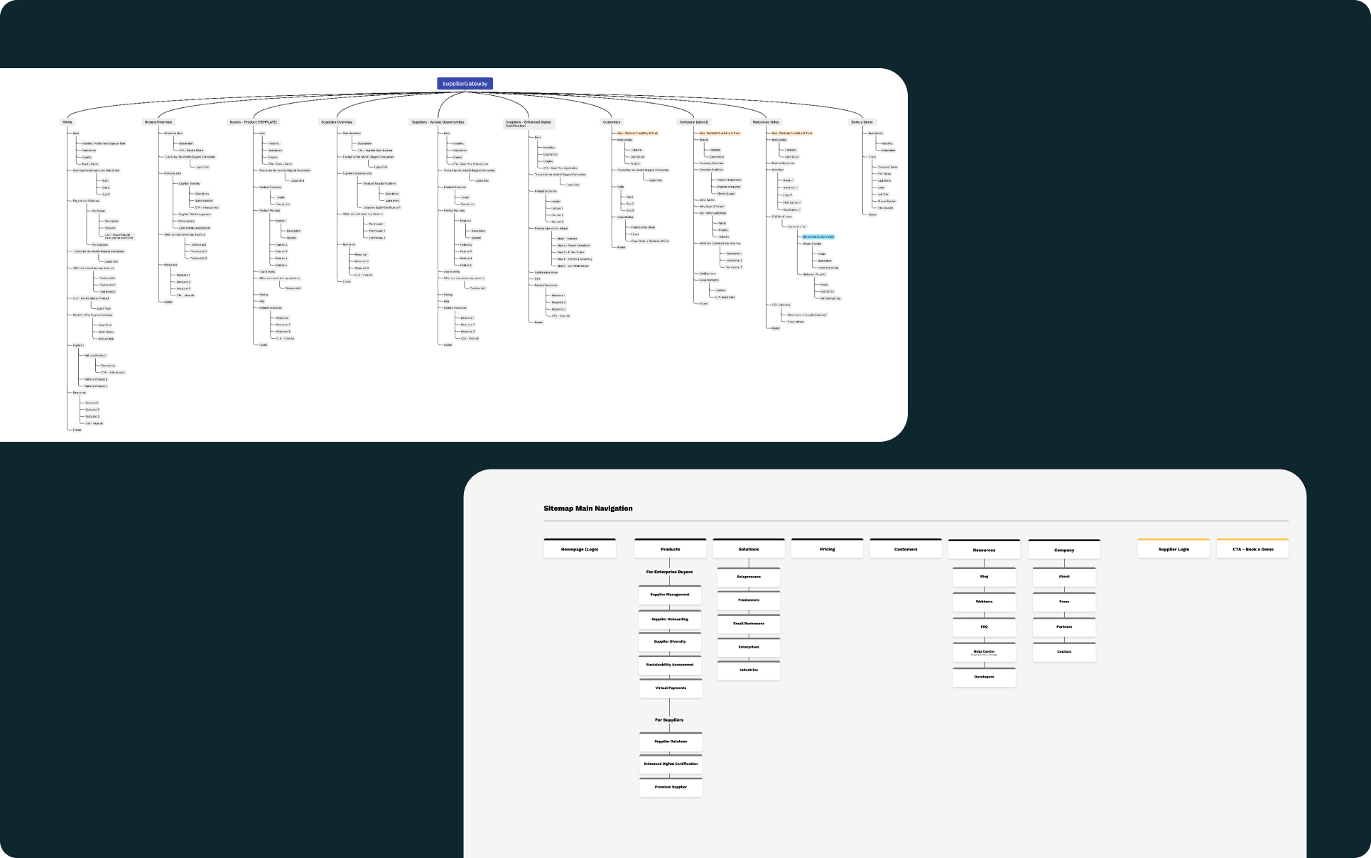
Supplier Gateway UX Case Study
Challenge: Transforming a B2B procurement platform website to drive more leads, increase sales of its "Enhanced Digital Certification" program, and encourage existing clients to explore additional services.
Initial Situation: The existing website suffered from low lead volume, confusing messaging due to its diverse product offerings, and a free trial process demanding too much initial effort from potential customers. Content lacked a clear call to action.
My Role:
- Competitor Analysis: Conducted a thorough analysis of competitor websites to identify best practices and potential gaps in the market.
- Information Architecture: Developed a clear and concise information architecture, making it easier for users to find the specific solutions they need.
- Mid-Fidelity Wireframes: Created detailed wireframes of the website, focusing on user flow and intuitive navigation.
Results:
- Increased Pipeline: The redesigned website generated over $355,000 in marketing qualified leads per month!
- Clearer Messaging: By streamlining the message and highlighting the value proposition, the website better conveyed the platform's benefits.
- Reduced Friction: Implementing a simplified trial process with minimal upfront effort encouraged more prospects to try the platform.
- Action-Oriented Content: Content was revised to include clear calls to action, guiding users towards desired next steps.
This case study demonstrates the power of a user-centered design approach in driving business results.
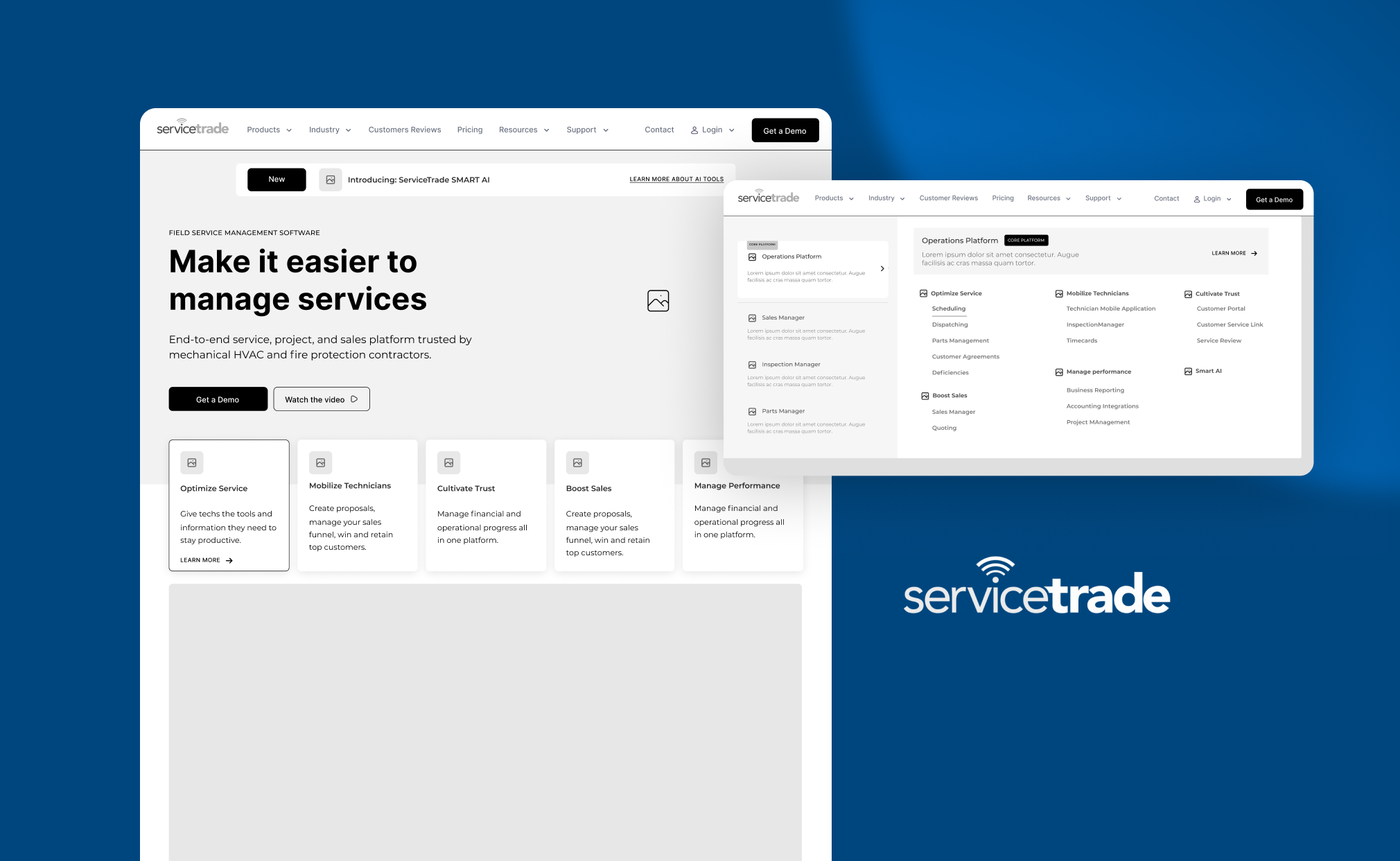
Service Trade UX Case Study
Challenge: ServiceTrade, a field service management software company, needed to improve their website's ability to attract leads, differentiate their brand from competitors, and clearly communicate their value proposition.
Initial Situation: The existing website suffered from low conversions of ideal customer profile (ICP) visitors, a lack of competitive edge due to less aggressive messaging, and complex information that felt like a textbook to navigate.
My Role:
- UX Phase: I undertook a comprehensive UX process, involving:
- Competitor Analysis: Identified strengths and weaknesses of competitor websites to inform our design strategy.
- Information Architecture: Redesigned the information architecture for intuitive navigation and easy access to relevant content for users.
- Wireframes: Developed wireframes to visualize user flows and ensure seamless interactions with the website.
Results:
- Lead Explosion: The redesigned website witnessed a staggering 700% increase in demo requests!
- Standing Out: By crafting compelling and differentiated messaging, we helped ServiceTrade stand out in the crowded field service management software market.
- Brand Alignment: The site now clearly reflects ServiceTrade's brand personality, making a stronger first impression on potential customers.
This case study highlights the impact of strategic UX design in driving user engagement, generating leads, and effectively communicating a brand's message.
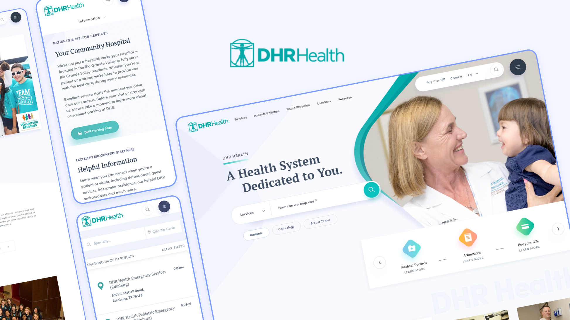
DHR Health Website UX Case Study
Challenge: DHR Health's website, previously built on a templated theme, suffered from navigation issues due to its vast size (over 700 pages) and reliance on generic templates. Analytics and user feedback indicated difficulty for patients and doctors in finding the right information quickly.
Initial Situation: The website's templated design offered a one-size-fits-all approach, failing to cater to the specific needs of patients and doctors. The large number of pages created a labyrinthine navigation structure, frustrating users and hindering their ability to find the information they needed.
My Role as Lead UX/UI Designer: I spearheaded a comprehensive UX/UI redesign project for the DHR Health website.
Improvements Implemented:
- Enhanced Information Architecture: The information architecture was reorganized to prioritize user needs. Content was categorized logically and intuitively, making it easier for users to find the information they seek.
- Improved Navigation: A user-friendly navigation system was implemented, incorporating clear menus, drop-down lists, and search functionality to facilitate easy exploration of the website.
- Quick Access to Key Information: Crucial information for patients and doctors, such as finding a doctor, scheduling appointments, or contacting specific departments, was made readily accessible through prominent placement on the homepage and key landing pages.
- Accessibility Optimization: The website was optimized for accessibility, ensuring usability for people with disabilities. This included features like screen reader compatibility, improved color contrast, and keyboard navigation.
Expected Outcomes:
- Increased User Satisfaction: By improving navigation and information findability, the redesigned website is expected to enhance user satisfaction and reduce frustration.
- Improved Conversion Rates: Easier access to key information and streamlined user journeys should lead to higher conversion rates, such as appointment bookings or online form submissions.
- Enhanced Brand Image: A user-friendly and accessible website can contribute to a more positive brand image for DHR Health.